


Navigating the Freelance World with Martin Philpot of Pure Graphic Design
https://puregraphic.design/wp-content/uploads/2025/01/Website-planet-Martin-Philpot-850x446-1.webp
850
446
martin
https://secure.gravatar.com/avatar/7038edce09f6c4104a2cff5bc0e00c00?s=96&d=mm&r=g
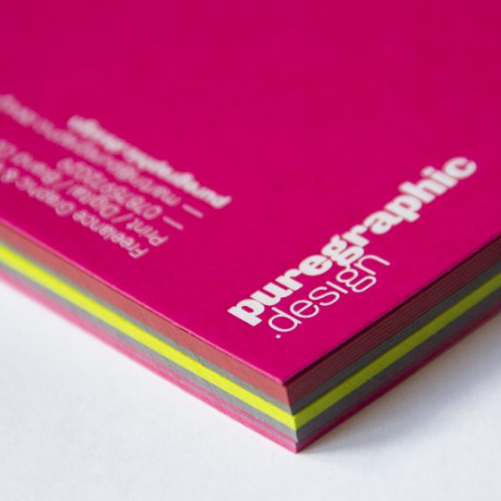
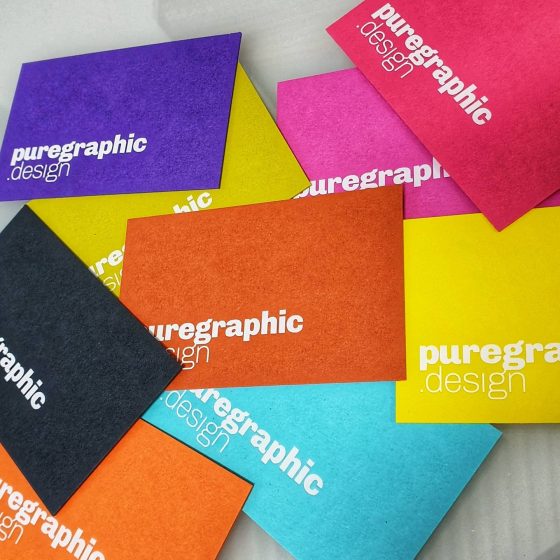
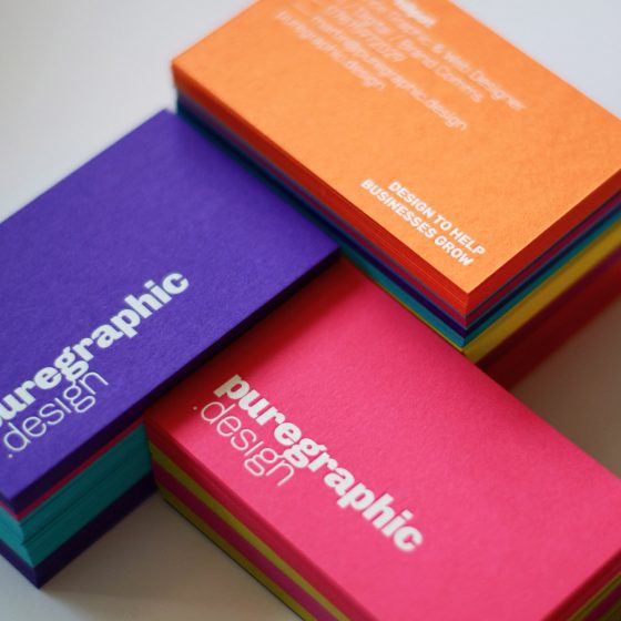
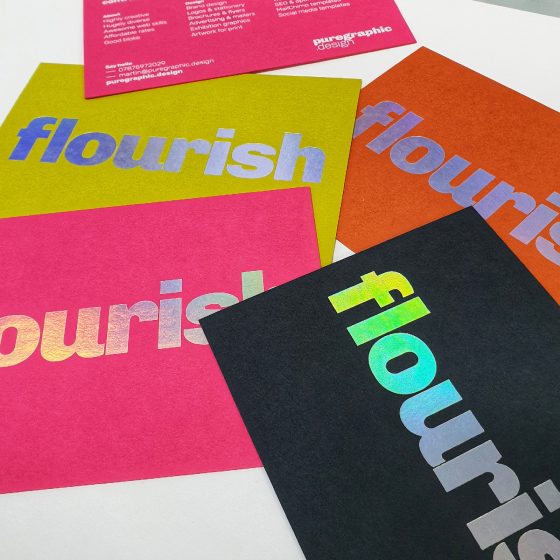
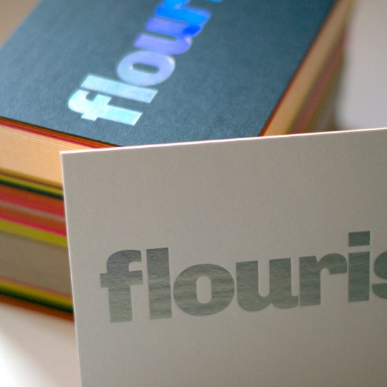
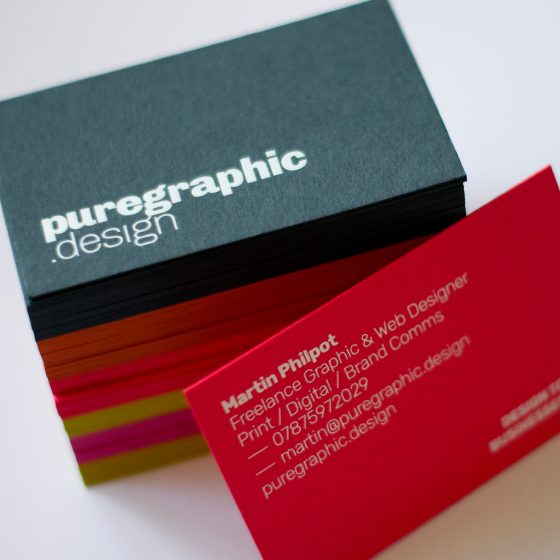
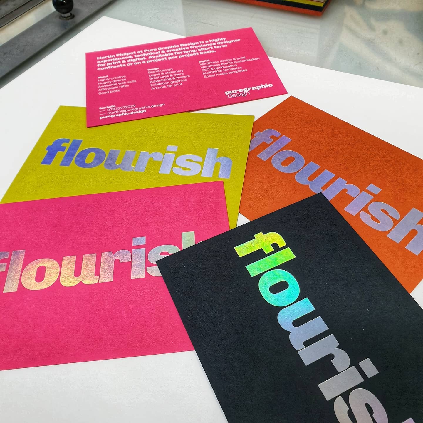
In the latest Website Planet interview, Martin Philpot, the founder of Pure Graphic Design, shares his journey from a side hustle born of necessity to a full-time freelance career built on versatility and expertise. Martin opens up about the pivotal moments that shaped his business, the diverse services he offers, and his ongoing mission to balance private client work with high-profile design contracts.
Read the full interview here:


 Arthur Woodham opened his own café in 1948, having previously worked in his father’s cafe of the same name just down the road.
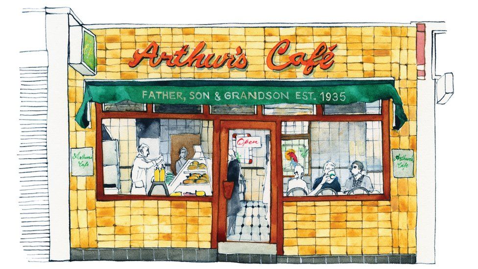
 Tucked under a railway arch near the Tower of London, this legendary eel, fish and shellfish shop attracts hordes of East Enders, eager for eels freshly boiled on the premises.
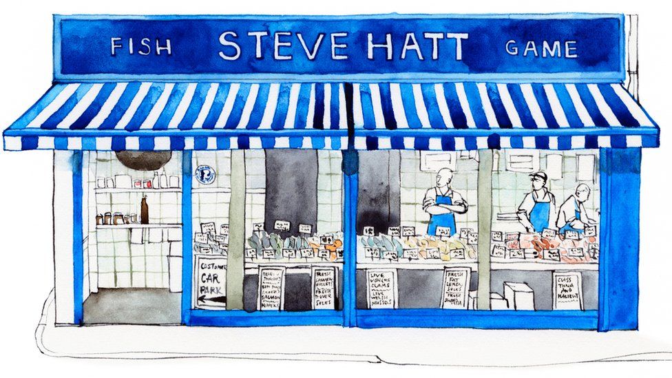


