


Campaigners have issued three core demands to the government: to “tell the truth about climate change”; to reduce carbon emissions to zero by 2025; and to create a citizens’ assembly to oversee progress.
With such a clear and strongly communicated set of demands it is no surprise that XR’s other communications have also been equally well thought through. People were already activated but not organised and the XR movement has acted as a powerful force for bringing people together under a shared identity – something bigger than themselves that they can be part of.
Trust
A well-developed brand proposition can also engender feelings of affinity, belonging, and trust. This is important if you aspire for an existing network to evolve into a real movement. You are inviting people to activate and demand change whilst holding a banner with your logo on it. Do not underestimate the level of trust that is required for this to happen.
The brand toolkit
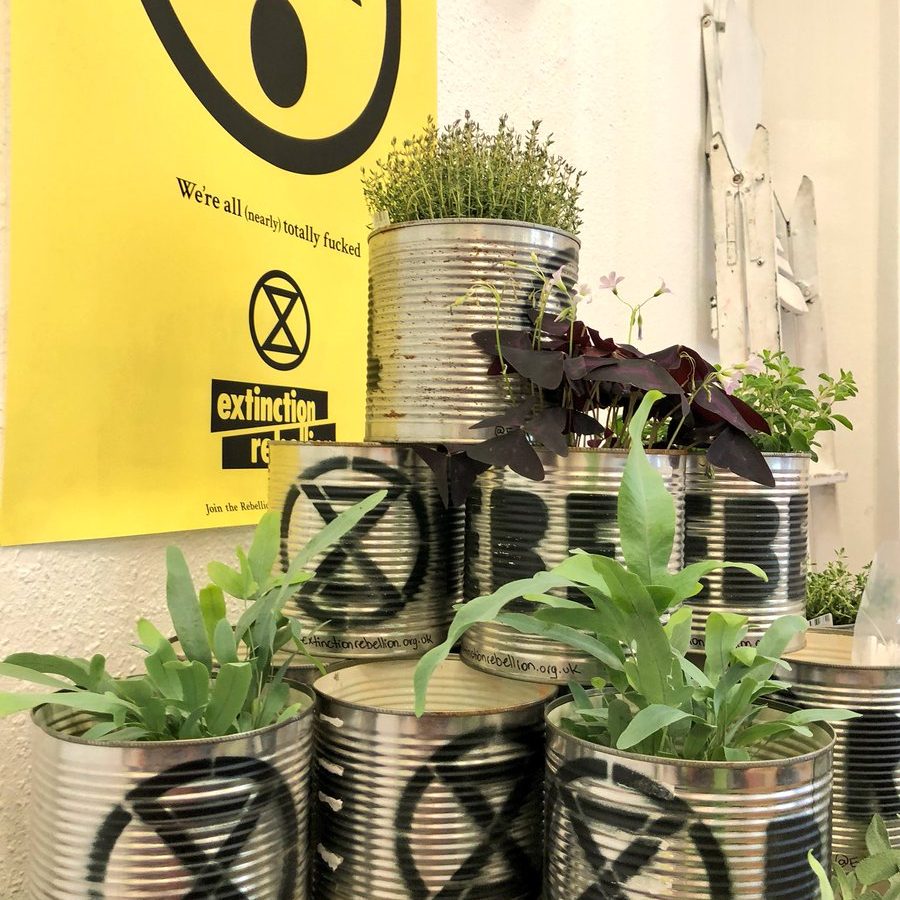
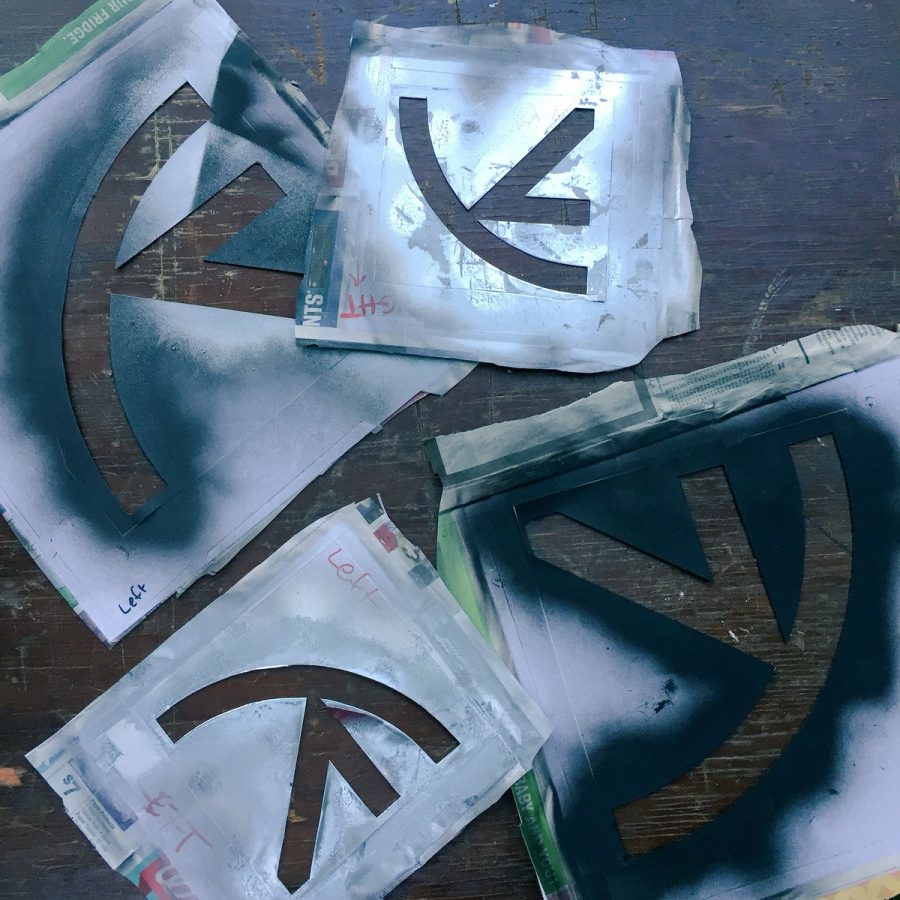
A huge amount of planning has gone into the Extinction Rebellion visual execution. They have an in-house art group, made up of graphic, fashion and stage designers and artists, who have created branded protest materials. Born from a strong visual foundation, they have expertly created a wider toolkit that is both recognisable yet adaptable.
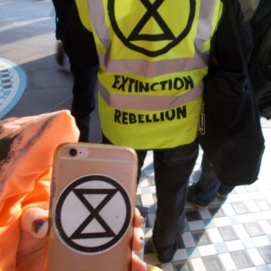
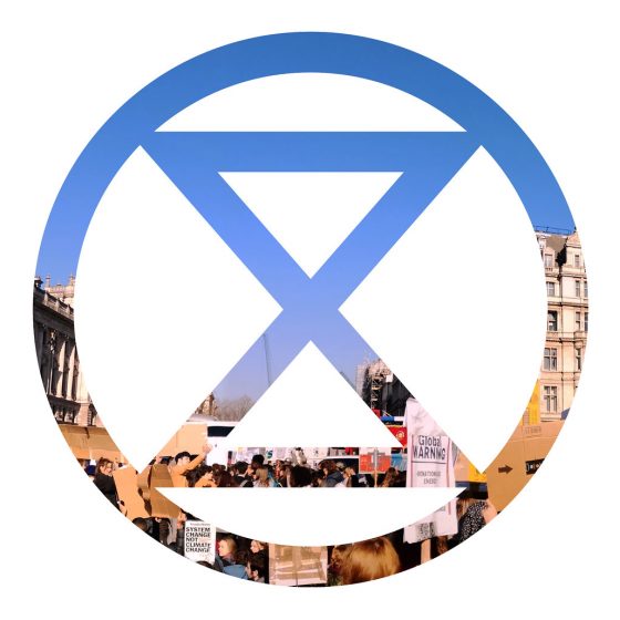
The Extinction Rebellion logo was designed by a street artist who wishes to remain anonymous. The logo features a stylised sand-timer set inside a circle, representing the planet and is a clear symbol that time is running out. This references the warning from the United Nations that we have just 12 years to limit global warming to 1.5 degrees Celsius, or risk catastrophic changes to the planet’s climate.
This sand-timer logo combined with the language used throughout the campaign clearly highlights the scale and urgency of the climate crisis.


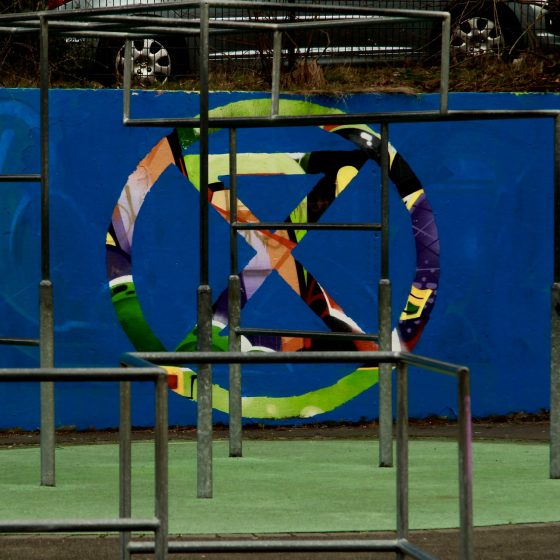
The simplicity of the logo has meant that it has been recreated on streets all over the globe in protest art and is instantly recognisable. It has been available for people to add to their facebook profile images, spreading the message further.
By contrasting the bold black logo and typeface with colourful graphics this works to give the movement an energetic and dynamic look and feel, emphasising the organisation’s passion and anger at the government’s in-action on climate change.
One of the most important things was that this movement needed to feel really inclusive. A lot of eco movements feel a bit hippy and exclusive, and not particularly urban. It was important to have a consistent look, so we could be an umbrella movement that everyone could come underneath.
Clive Russell, Graphic Designer at Extinction Rebellion


Pushing boundaries of design
Another great way of making the organisation inclusive and accessible has been the free availability of their protest graphics to download from their website, provided they are used strictly for non-corporate purposes. This open-sourcing of their graphics has allowed people to take a sense of ownership over the rebellion by making their own protest materials.
Maintaining a co-ordinated graphic identity in the corporate world is tricky, but this more spontaneous way gives the movement a stronger, more vibrant visual identity. It’s anti corporate subversiveness is what makes it so engaging and striking, lending itself to quick adaptions, home-made slogans and graffiti and that’s why I love it so much.


Adapted from an article from Thisisyoke:
https://www.thisisyoke.com/blog/branding-a-movement-extinction-rebellion/